27 April 2021
Time to Refresh: Refreshed Logos of Global Automotive Brands
Time to Refresh: Refreshed Logos of Global Automotive Brands
In today's world where rapid change is continuous, keeping up with change is an indication of a compulsory process for each institution and organization as well as the individual. As logos, the first visual image created by a brand against its customers, are one of the important factors affecting this change process and at the same time being affected by this process.
Sometimes, the logo designs of the companies may not keep up with the pace of the age or don’t reflect the image of the brand. In such cases, coming up with a refreshed logo allows the customers to recreate the desired image in the eyes. Many global automotive brands pioneered this logo change trend in the new year. Especially with the widespread use of electric and hybrid car technology, many automotive brands have redesigned their logos. Let's examine these global automotive brands that are entering the year 2021 with their refreshed new logos.
Renault
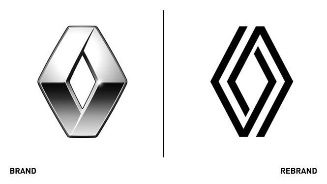
With its refreshed logo, Renault has switched from three-dimensional model design to two-dimensional design, one of the new trends. Gilles Vidal, Renault's Design Manager, emphasized that the new logo design is more suitable for technologies such as websites, apps, smartphones and screens inside vehicles.
Peugeot

Julie David, General Manager of Peugeot UK, stated that the new logo for the new logo design reflects the company's changing model range and new philosophy of living in the moment. In addition, the new logo was designed to reflect the introduction of high-end market-oriented electric vehicles and to be timeless.
General Motors
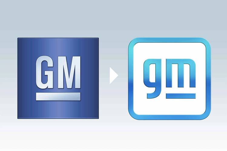
GM Marketing Manager Deborah Wahl said the color choice used in the design of the new logo signifies "the clear blue sky of an all-electric future", while the transition from capitals to lowercase letters means "more inclusiveness, easier accessibility and a more human direction." We can say that it is similar to smart phone applications in terms of appearance.
Volkswagen
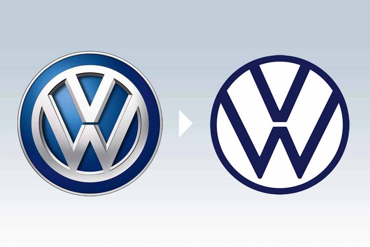
Volkswagen Chief Designer Klaus Bischoff said of the logo's design, "My personal goal in this redesign was to keep the W in the air, bringing a new lightness to the Volkswagen brand. Of course, this new brand is bringing Volkswagen into the digital age, and our classic logo which can be easily displayed digitally on devices and applications, turns it into a trademark ”.
BMW
BMW officials stated that the new design is an expression of the brand identity that places the customer at the center of all activities. BMW's new two-dimensional design reflects the shift from focusing entirely on the automotive world to being about technology and connectivity. The transparent version of the logo is said to create an open invitation for customers to join the BMW world.
Kia
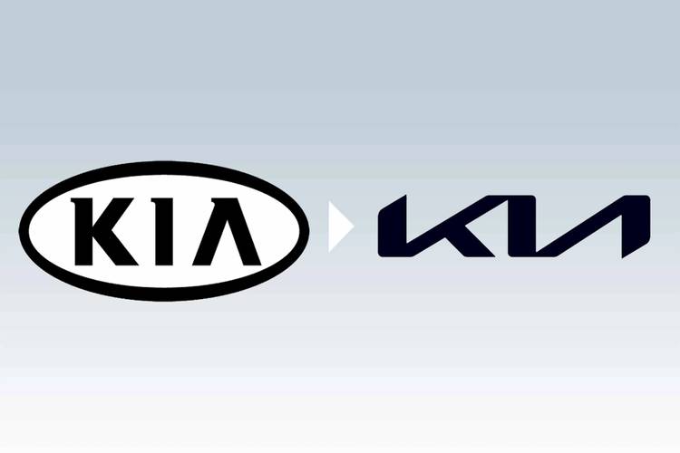
Kia officials said that their new designs are a symbol of the values promised to offer customers and the experiences they provide. Kia tried to fulfill its brand promise by developing a logo that resembles a handwritten signature. The rhythmic, uninterrupted line of the logo reflects Kia's determination to bring inspirational moments, while its symmetry shows confidence.
Opel
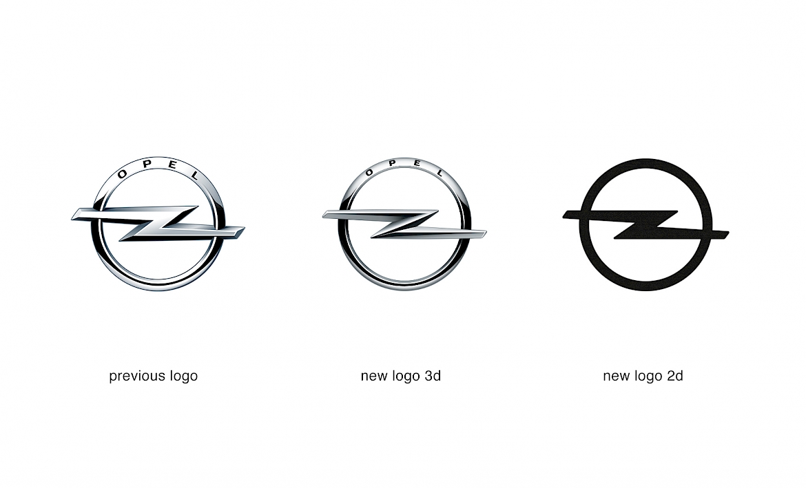
Regarding the new Opel logo, Mark Adams, Opel Vice President of Design, stated that the outer circle of the new logo is thinner, more elegant, more gentle and more prominent. He added that the details further emphasize the logo of the brand and that the details are very sharp. He stated that the 'Opel' inscription was integrated into the lower part of the circle like a fine engraving on a piece of jewelery.
Nissan
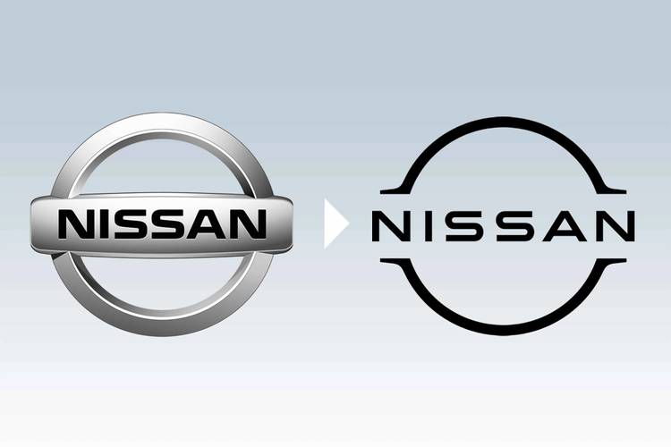
Nissan officials said about its new designs that it portrays the company's rich heritage and its outlook for the future, proudly adhering to its tradition of innovation. In addition to these, they stated that the Nissan name remains at the center of the logo which creates a brand image that reminds past milestones, instant recognization and memories but also conveys the development.
Dacia
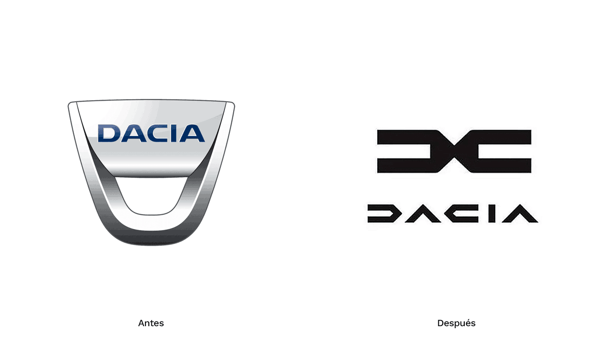
In addition, Dacia, one of Renault's subsidiaries, is taking its place in this new logo trend. Leaving behind its old logo that resembles a bottle opener, Dacia has presented a contemporary design with the letters "D" and "C" facing opposite directions in its new logo.